
Extending
VuePress default theme is widely used by users, so it is designed to be extendable, allowing users to make their own customization with ease.
Layout Slots
Default theme's Layout provides some slots:
navbarnavbar-beforenavbar-aftersidebarsidebar-topsidebar-bottompagepage-toppage-bottompage-content-toppage-content-bottom
With the help of them, you can add or replace content easily. Here comes an example to introduce how to extend default theme with layout slots.
Firstly, create a client config file .vuepress/client.ts:
import { defineClientConfig } from 'vuepress/client'
import Layout from './layouts/Layout.vue'

export default defineClientConfig({
  layouts: {
    Layout,
  },
})
Next, create the .vuepress/layouts/Layout.vue, and make use of the slots that provided by the Layout of default theme:
<script setup>
import ParentLayout from '@vuepress/theme-default/layouts/Layout.vue'
</script>
<template>
<ParentLayout>
<template #page-bottom>
<div class="my-footer">This is my custom page footer</div>
</template>
</ParentLayout>
</template>
<style lang="css">
.my-footer {
text-align: center;
}
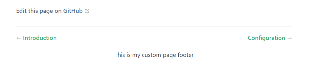
</style>Then the default Layout layout has been overridden by your own local layout, which will add a custom footer to every normal pages in default theme (excluding homepage):
Components Replacement
The layout slots are useful, but sometimes you might find it's not flexible enough. Default theme also provides the ability to replace a single component.
Default theme has registered alias for every non-global components with a @theme prefix. For example, the alias of HomeFooter.vue is @theme/HomeFooter.vue.
Then, if you want to replace the HomeFooter.vue component, just override the alias in your config file .vuepress/config.ts:
import { defaultTheme } from '@vuepress/theme-default'
import { defineUserConfig } from 'vuepress'
import { getDirname, path } from 'vuepress/utils'

const __dirname = import.meta.dirname || getDirname(import.meta.url)

export default defineUserConfig({
  theme: defaultTheme(),
  alias: {
    '@theme/HomeFooter.vue': path.resolve(
      __dirname,
      './components/MyHomeFooter.vue',
    ),
  },
})
Modifying Behavior
Most of the core behaviors of the default theme have been extracted into a composable API or util function, and also provide aliases with the @theme prefix.
For example, if you want to add some default values to the theme data of the default theme, you can override the useThemeData function of @theme/useThemeData.
Developing a Child Theme
Instead of extending the default theme directly in .vuepress/config.ts and .vuepress/client.ts, you can also develop your own theme extending the default theme:
import type { DefaultThemeOptions } from '@vuepress/theme-default'
import { defaultTheme } from '@vuepress/theme-default'
import type { Theme } from 'vuepress/core'
import { getDirname, path } from 'vuepress/utils'

const __dirname = import.meta.dirname || getDirname(import.meta.url)

export const childTheme = (options: DefaultThemeOptions): Theme => ({
  name: 'vuepress-theme-child',
  extends: defaultTheme(options),

  // override layouts in child theme's client config file
  // notice that you would build ts to js before publishing to npm,
  // so this should be the path to the js file
  clientConfigFile: path.resolve(__dirname, './client.js'),

  // override component alias
  alias: {
    '@theme/HomeFooter.vue': path.resolve(
      __dirname,
      './components/MyHomeFooter.vue',
    ),
  },
})